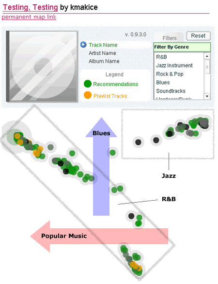
So Justin fixed the issue with his MyStrands recommender system and got my test playlist working. It is a a thrown-together playlist that includes Laurie Anderson, Rebirth Brass Band, Ray Charles and Johnny Clegg. Eclectic, to say the least.
My recommenders map for this playlist came out pretty interesting. The first observation was that it appeared to have three very distinct niches surfacing. However, when I looked at the genre filter, it turned into two — a Jazz niche and the core R&B (heavily influenced by all the Ray Charles songs). The two ends of the latter were probably pop rock down to gospel, but there was no “Gospel” option in the filtering tool. The orientation seemed to put Blues songs toward the top, and more popular songs showing up on the left side.
There were also some missing items from my playlist. I found all of my Ray Charles tunes, the New Stories song, and the one piece by Laurie Anderson. Missing were Johnny Clegg and Re-Birth Brass Band, although their impact was clearly seen in the Jazz niche and some scattered World Music songs. Where did they go? It was also unclear what the different shades of green represented, or the many completely black nodes that showed up. If that is an indication of affinity to my playlist songs, I’m not sure I’d ever care. I’d value that kind of distinction only if I could do something with it, like tune the sensitivity to mask the least recommended songs.
It would be nice to be able to address, through this tool, the tagging of niches by the user. There is no gospel or spiritual listed in the genres, but that is sort of what the lower spike says to me. I’d also like to see some overall major genre visualization for the neighborhood as a whole. Instead of the arrows I used above, maybe a gradient circle in the background that tries to show it as a pie chart. Maybe that would be overkill, and I certainly wouldn’t want every genre included. But in this case, it might be very informative to see a circle divided into R&B and Jazz underneath the actual map. Most importanly, I’d like the ability to know which nodes I’ve already explored. The move-away feature of the navigation is great, but there are still too many greenish dots to wrap my head around. Having some visual clue that says whether I’ve seen something or not would be appeciated (perhaps triggered only when the other nodes are out of a specified radius).
