An interesting new visualization for Twitter content was launched Wednesday evening. The Social Collider—a Google Chrome Experiment created by Karsten Schmidt and Sascha Pohflepp of the UK—reveals cross-connections between conversations on Twitter.
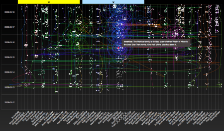
Social Collider, a Chrome Experiment in action
The project is several months in the making. The @socialcollider Twitter account posted the first update about a revision in early January. Social Collider is one of the nineteen initial Chrome Experiments, which showcase interesting uses of JavaScript and web browsers created by designers and programmers from around the world. In the description of their project, Schmidt and Pohflepp describe the information problem:
With the Internet’s promise of instant and absolute connectedness, two things appear to be curiously underrepresented: both temporal and lateral perspective of our data-trails. Yet, the amount of data we are constantly producing provides a whole world of contexts, many of which can reveal astonishing relationships if only looked at through time.
The solution is inspired by visualizations for particle colliders, drawing pictures of how the subatomic matter interacts. The tweets that resonated with others connect horizontally with those of other users writing about relevant topics. Sometimes the connections are direct and obvious, but this visualization also reveals more subtle relationships amongst all the Twitter activity.
To start the visualization, you define two options. First, the keyword search can be done on a username, a phrase, or the trends tracked by Twitter. Second, determine the duration of the data set, from one day up to one month. Once submitted, the querying begins to populate a graph with tweets. The most recent tweets are represented as dots at the top of the screen, and each user in the network appears as its own column of dots—identified by topic, link, or username at the bottom of the screen.
That’s when the magic happens.

Social Collider shows how my tweets are related to others
Using connector cues, such as @username references and shared links, the visualizations starts tracing the connections made between tweets. Every colored track is a new related topic; You can trace the patterns of how the content and people are connected by following any line. A flash of retweets might be a tight circle contained near the top of the page, whereas more persistent topics run the height of the screen. Conversations spiral around between users, easily identified from the mass of dots.

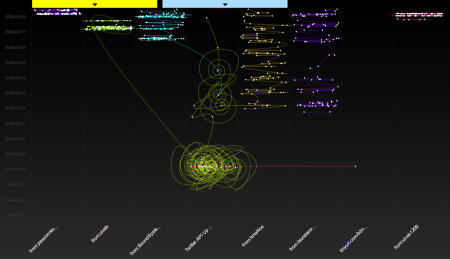
A topic search for my the initial announcement of my book

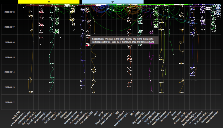
The AIG scandal is tracked as a Twitter trend
The weaknesses of Social Collider are few but important. Each tweet can be revealed by mousing over any dot, but the target is so small that this becomes a difficult task, impeding exploration. At least on my MacBook, loading this tool results in that jet engine sound that accompanies a heavy processor load. I was unable to leave the visualization, too, without the browser asking me to manually stop the script from running.
I was impressed, however, with the patterns that did emerge. The user search appears to be the easiest to comprehend, showing how my most recent tweets on topics like Star Trek and AIG fit in with or sparked other posts. My new book, “Twitter API: Up and Running,” got a plug and a bunch of retweets a week ago. Those show up as a swirl and a red line crossing several users. My test of the Twitter trend “AIG” was surprisingly segregated, with not much activity running horizontally. I’m not certain what that means, but I do appreciate that the visual patterns are made easy to identify should I want to investigate.
Give it a try. This kind of insight and originality is sure to characterize Twitter visualizations in 2009.
9 replies on “Social Collider”
and web browsers is inspired by particle colliders to reveal the hidden connection between tweets Or a program developed for google chrome, Social Collider gives twitter relationships a gorgeous visual representation. Quote and video viablogschmog.net, by Kevin Makice.
nt-weight:bold; text-decoration:none; } img {border:none;} not art Links for 2009-03-19 [del.icio.us] Posted: 20 Mar 2009 12:00 AM PDTSocial Collider | A Chrome Experiment Reveals Hidden Connections Between Tweets | BlogSchmogAn interesting new visualization for Twitter content was launched Wednesday evening. The Social Collider—a Google Chrome Experiment created by Karsten Schmidt and Sascha Pohflepp of the UK—reveals cross-connections between conversations on Twitter. DIGITAL_LAB
2009 by William Lark 0 Â Add a Comment A Twitter visualization project using javascript and web browsers is inspired by particle colliders to reveal the hidden connection between tweets. Go here to see the original:Â Social Collider
[…] Your page is on StumbleUpon […]
[…] Social Collider | A Chrome Experiment Reveals Hidden Connections Between Tweets | BlogSchmog SAVE really nice & fair analysis/write up toxi […]
[…] Link: Here’s a great description by Kevin Makice of how it works and what all the coloured lines and dots […]
[…] to it are love material. Here’s one, previously reported on grinding, referring back to blogschmog: A Twitter visualization project using javascript and web browsers is inspired by particle […]
[…] Makice family, published since 2000.Ratings (2 Ratings)Popularity:7 Followers Blog Feed Social Collider 2009-03-18 TwitScoop and Humanity 2009-03-13 Healthy Kids, Happy […]
[…] Social Collider | A Chrome Experiment Reveals Hidden Connections Between Tweets | BlogSchmog – http://www.blogschmog.net/2009… March 19 from delicious – Comment – Like – Share really nice & fair analysis/write up – […]