The first argument one has in introducing people to Twitter is that the service is more than the sum of its tweets. Once people discover that—usually only after following some friends they already know and using something other than the web to access the content—the next challenge is in showing that Twitter is more than just a social network.
Jeff Clark, a Canadian programmer and visualization fanboy, released a neat visualization Tuesday leveraging Summize‘s API of Twitter content. Twitter StreamGraph examines the last 200 tweets containing a given keyword or @username, parsing the rest of the words in those messages into a time-arranged stacked graph.

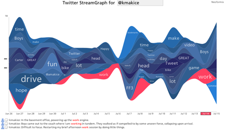
Twitter StreamGraph for @kmakice
The StreamGraph is a visualization technique originating with the work of Lee Byron and Martin Wattenberg for the New York Times in February 2008. That project depicted box office revenues for 7500 movies over a two-decade span. Inspired by Byron’s later StreamGraphs of Last.fm music listening history, Clark adapted the technique to create an interactive tool for Twitter information.


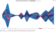
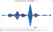
Four streamgraphs show completely different trends. The keywords used for these searches were: informatics, Bob Schneider, makice and Bloomington.
The 200 tweets are graphed on a horizontal timeline from oldest to most recent, scaled to fit in the available space. This creates some interesting visual meaning, as content scrunched toward the left side might indicate a dormant topic. Each of the other words are sorted for frequency and stacked vertically near a center line. Each band reflects the ebb and flow of use of that work in conjunction with the search keyword, creating a wavy pattern. Tall parts might mean many different words or many uses of the same words.
In his search results, Clark allows you to focus on a single word from the list of secondary terms in the visualization by clicking on it. The corresponding band turns red and reveals some of the specific tweets that use both words (the secondary term and the search keyword). Exploration is facilitated by making words in the tweets clickable themselves, spawning a new StreamGraph.
To test the tool, I tried a few personally relevant searches, leading to some interesting insights:
- makice—My last name is not used in isolation very frequently. I wonder if a future iteration by Clark might allow this search to include content for both Amy and myself.
- informatics—Realized I most commonly refer to my school as “SOI” or “IU,” not “informatics.” Most of the informatics conversation on Twitter is done by Europeans with an emphais on biomedical and health informatics. There were a few interesting spikes I remember about ambient informatics and personal informatics, too.
- Bloomington—Much of this content is due to an Illinois newspaper using Twitter as an RSS broadcaster. There was also a big spike when gas price watching on the west coast found a station nearing $5 per gallon. This term is too noisy to be a good Twitter search, thanks to Bloomingtons in at least three other states. This is where a filtering mechanism would be helpful.
- Bob Schneider—Our favorite rocker has some definite patterns of activity over weekends, when the Austin singer is giving concerts. Quite a few song titles are have recognizable parts in this stream.
- @kmakice—I have a wide stream, with up to about 15 tweets in a day.
Clark is also responsible for two other appealing visualizations of Twitter: TwitArcs and Twitter Spectrum. The visualizations are all composed in Processing, a development tool that is making it easier for programmers and non-programmers to create interactive visuals.
Signs of good health for Twitter
The StreamGraph release comes on the heels of some encouraging news about everyone’s favorite microblog whipping boy. Twitter, which experienced some crippling downtime in May and June, appears to have turned a corner toward stability without losing their growth in membership. Now that third-party applications are coming back online as well, Twitter is starting to add new features again.
After officially acquiring one of those applications—Summize—Twitter announced embedded search tools built on that new platform. The new search is nice because it keeps track of new content even as you are perusing the previous results, updating the page title with a growing count in much the same way Gmail does for new email messages.