Most ideas are a Google search away from finding someone else who already thought of it enough to build a tool to share. At the start of the summer, I was thinking it would be great to have an interactive card sorting tool that would allow me to solicit input on grouping, prioritizing and categorization from people I would have to travel hundreds of miles to see. Thanks to a mid-summer tip from Tyler, enter OptimalSort.

Card sorting exercises for users you can’t see.
The site was created by Optimal Usability, an Internet consulting and services firm in New Zealand. After having the same idea I had three years ago, they built OptimalSort and made use of it for their own information architecture projects. Only recently has the site been released into the wild. Accounts are free at the moment, but the plan is to start charging toward the end of 2007. Director Sam Ng wrote, “[I]t won’t happen until we, ourselves, feel that the software is at a level where we ourselves would pay for it.”
At the moment, registration is free and simple. Each new card sorting project requires a few minutes with a wizard to configure the exercise. The process is very nice, simple and self-explanatory—It was easy to go back and forth to make changes and very clear when I was at that point of committing to my project. In the end, a project gets its own URL to share with future participants. Currently, I have an open sort project about search content available online.

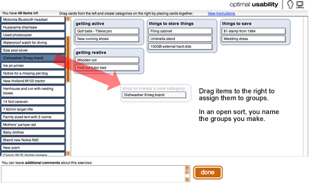
The card sort interface allows participants to drag pre-defined items into user-defined groups.
The expertise embedded into the site is stellar. My account started with a couple of demonstration projects to help understand how things work. One is a close sort (where the participants are limited to the groups you define) and the other an open sort (where participants can name their own groups). There is also card sorting advice throughout the wizard offering suggestions without being intrusive.
According to Ng, similar tools exist. Websort and Mindcanvas are solid but with a different analytical emphasis. “We’re encouraging people to THINK about their results rather than simply turn to a dendrogram (tree diagram) output for their answers,” writes Ng. “A mathematical formula is only going to take you so far and it’s never going to be as smart as you.”
This Beta version of OptimalSort is missing some functionality, of course. There is no easy way for a participant in a study to rearrange the groups and express priority. This may also interfere with the user experience. I had some difficulties in the sample projects seeing all of the categories on my little MacBook screen without scrolling. Each project only allows for one sort and one survey, placed before the sorting begins. While the tool would be bloated by giving designers Survey Monkey kinds of controls, it would be a useful feature to allow for an exit survey and a few small card sorts from one project link.
Ng indicated changes are in the works, including the possibility that contextual commenting and category arrangement by the participants will be available in a future release. Many of the improvements will be directly inspired by the designers using the site, with projects ranging from several to seven thousand participants. “We’re learning a lot about how card sorting is being done all around the world,” writes Ng. The primary focus for the mid-October upgrade will be on the participant grouping interface and improving the analytics.
Evangelizing Sort
The sort results from the site are able to be exported as delimited data and used in some statistical analysis, but one of the strengths of the tool is that it isn’t overtly statistical. A card sort is more about identifying useful patterns, not proving validity. The developers discuss this a bit on their blog:
Dendrograms are too convenient. These three things, stick them together and you have a category (but only if you accept a 90% confidence level and a total of 5 categories). It feels like dendrograms may be popular because they give easy answers. A quantitative answer to what is often a qualitative question. We think it is dangerous to expect card sorts to provide concrete answers. At best, they help you realise you’re asking the right questions.
In addition to the helpful comments embedded in the configuration process, OptimalSort provides links to Excel templates by Joe Lamantia and Donna Maurer that can accept the raw data. From a design perspective, even that may be overkill.
“Our goal is actually to encourage the use of card sorting,” writes Ng. “While it’s an awfully simple method, there seems to be a bit of confusion about it and a reluctance to do it.” Card sorting is not well understood and can be complicated to organize. It can be even more difficult to analyze, and therefore is often deemed too much resource investment for too little payoff. Ng hopes that, through improvements to OptimalSort, more designers will be encouraged to use card sorting at the start of projects.
As the fall semester looms for many graduate designers, OptimalSort might be a useful site to bookmark. According to Ng, there will likely be some educational discounts available after they start charging, but some of your current projects could benefit from some card sorting now, too. Try it out.